Barking dogs
June 21, 2020 – Weekly comment
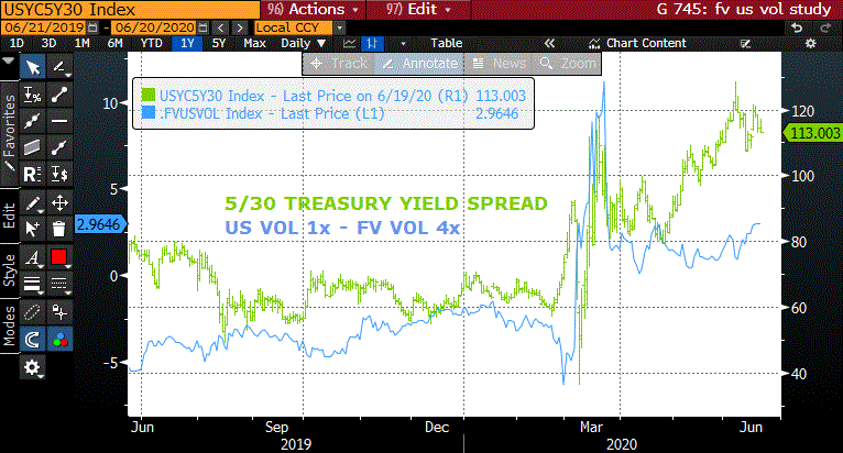
In a daily piece last week I mentioned that bond (US) vol relative to five-year (FV) vol was as high as I have remembered seeing it. After that comment I received a call from a treasury market-maker friend who wanted to discuss this topic in more detail, so I created the chart below, and figured it’s worth a brief note. I generally keep an eye on the ratio between FV and US DV01 and the ratio between the two implied vols. Currently the DV01 ratio is 4 FVU0 to 1 USU0 ($54.40 in FVU vs $219.60 in USU). If the vol ratio was also 4 to 1, then if FV vol was for example, 1.7, bond vol would be 6.8. Typically though, bond vol is less than the DV01 ratio, because the belly of the curve is more volatile. That is, if FV vol was 2.0 then bond vol would run something like 7.5.
What I did on the chart below is make the assumption that the DV01 ratio over time is generally around 4, so the blue line is US vol -4x FV vol. If that level is zero, then bond vol is exactly 4x greater than FV. If it’s negative, then bond vol is less than 4x FV vol. Pretty crude construction, I know, but this is just a jumping off point. What we see is that since the March crisis, bond vol is relatively high compared to FV. On Friday I marked FVU0 1.7 and US 10.0, which puts the blue line a bit over +3. When the 5/30 cash curve chart is overlaid (green) it appears that as the curve steepens, bond vol perks up on a relative basis.

Makes sense I suppose, given discussions of yield curve control which is generally thought to encompass 3 to 5 years, combined with additional treasury supply in the long end (new 20’s). We could just leave the conversation at that…
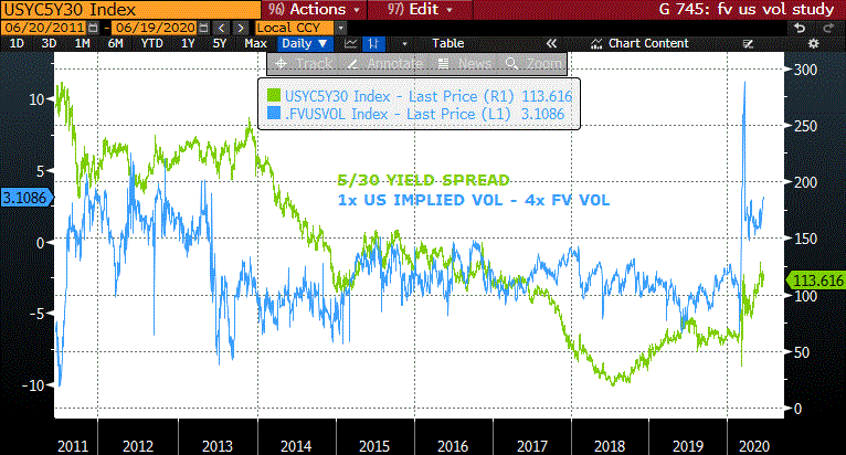
But… I looked farther back with the same 1 to 4 relationship even though the DV01 ratio isn’t always constant. I thought it was somewhat interesting that the last time 1 bond vol was greater than 4 FV vol was in 2012/2013. (Represented by the blue line > 0). This was also a period of FF rate at zero, and an expanding Fed balance sheet due to QE. Note the sharp drop below zero in 2013. The TAPER TANTRUM. In May of that year, Bernanke appeared before Congress and hinted the Fed was considering tapering bond purchases. After the turmoil unleashed by that appearance, the Fed didn’t actually begin to taper until December. I’ll just mention a couple of other stats for the sake of comparison: After the GFC, unemployment topped at 10% in 2009, and began to consistently decline from late 2010 on. In 2013 the unemloyment rate started at 8.0% and ended at 6.9%. According to a Reuters article it was generally thought the Fed would move off the zero bound when that rate fell below 6.5%. In the middle of 2014 the U rate fell below 6.5 and continued its descent. The Fed’s first rate hike was in December 2015. Core PCE yoy deflator bottomed in April 2013 at 1.4%. It zigzagged higher in the next year, topping at 1.7% in May 2014, and then proceeded to decline fairly sharply, ending 2015 at 1.2%, and that’s when the Fed first hiked, surprisingly enough. By 2017 Core PCE yoy price had moved to 1.85%.

The unemployment rate now is 13.3% and the Core YOY PCE is 1.05%, the lowest is has been since 2011.
Another interesting side note regarding 2013 is that the IMF’s April release of its World Economic Outlook channeled Sherlock Holmes with a chapter titled “The Dog that Didn’t Bark; Has inflation been muzzled, or was it just sleeping?” This weekend, Reuters ran an article titled, “Inflation dog may finally bark, investors bet” noting heavy investment flows into gold, timberland and inflation-indexed bonds.
As can be seen from the above chart, 5/30 spread declined through 2014 following Bernanke’s May appearance in 2013 and the initial actual onset of tapering in December. However, this year, 5/30 has been rising. While actual inflation numbers are down, forward looking surveys such as U of M’s 1-year and 5-10 year inflation expectations are surprisingly strong (3.0% and 2.6%). The NY Fed’s May survey of consumer expectations had the one-year horizon on inflation rising 0.4 pct to 3.0% while the median 3-yr inflation expectation was unchanged at 2.6%.
My takeaways: I feel that bond vol is elevated on a relative basis because of 1) yield curve control expectations 2) increased supply 3) increasing inflation expectations. None of these factors is likely to change much in the near future. In the latter part of 2012 to early 2013 5/30 was around 225 bps, double the current 114.
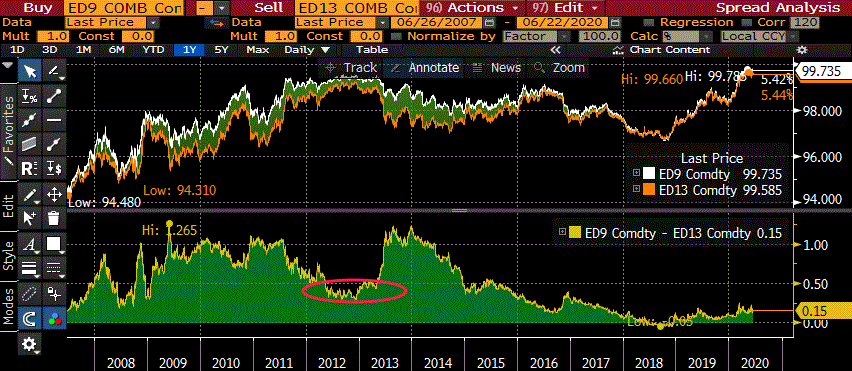
I also think the back end of the euro$ curve is quite flat. For example, the chart below shows the one-year constant-maturity first green to first blue, the 9th to 13th contract spread. In late 2012 to early 2013 this spread was quite contained, averaging 40 to 45 bps. With the tantrum as catalyst it surged to 119 bps. Currently, 1st green to 1st blue is EDU’22 to EDU’23 at a spread of 15. It seems expensive in the moment, as the 1st red to 1st green is only 6 bps. But on a historical basis, risk/reward appears to favor buying back calendars. Timing is key. (No sh-t, Sherlock!)

Data this week may not be all that important, but on Friday we will get both PCE price data and U of M final inflation expectations.
| 6/12/2020 | 6/19/2020 | chg | ||
| UST 2Y | 18.9 | 18.5 | -0.4 | |
| UST 5Y | 32.5 | 32.5 | 0.0 | w/I 34 |
| UST 10Y | 69.9 | 69.7 | -0.2 | |
| UST 30Y | 144.9 | 146.6 | 1.7 | |
| GERM 2Y | -67.2 | -66.9 | 0.3 | |
| GERM 10Y | -43.9 | -41.5 | 2.4 | |
| JPN 30Y | 53.7 | 56.6 | 2.9 | |
| EURO$ U0/U1 | -9.0 | -8.5 | 0.5 | |
| EURO$ U1/U2 | 5.5 | 6.0 | 0.5 | |
| EURO$ U2/U3 | 15.0 | 15.0 | 0.0 | |
| EUR | 112.57 | 111.79 | -0.78 | |
| CRUDE (active) | 36.51 | 39.83 | 3.32 | |
| SPX | 3041.31 | 3097.74 | 56.43 | 1.9% |
| VIX | 36.09 | 35.12 | -0.97 | |
file:///C:/Users/alex%20manzara/Downloads/_c3pdf.pdf

